Case study
212 Chicken — Crunch in Motion
A bold and immersive digital experience created for 212 Chicken, combining strong brand direction, scroll-driven motion, an interactive menu, restaurant discovery, technical SEO and a responsive experience designed around the energy of the brand.
Case study by Keltoum Malouki
The project
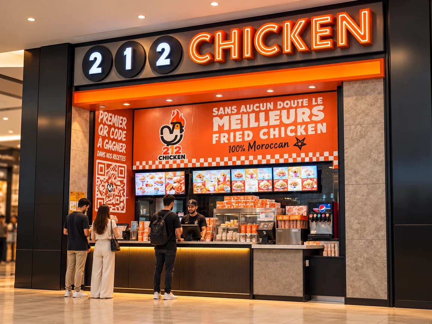
212 Chicken is a restaurant website built around the creative concept “Crunch in Motion”.
The goal was to create a digital experience that immediately communicates the personality and energy of the brand.
Instead of following a traditional restaurant website structure, the experience combines bold product compositions, expressive typography and motion that reacts to the visitor's journey.
The challenge
The main challenge was balancing a strong visual direction with simple navigation.
The platform needed to allow visitors to:
- discover the brand;
- browse the menu;
- search products;
- filter categories;
- view product details;
- find restaurants;
- access social channels;
- reach ordering when a verified ordering destination is available.
At the same time, animation and rich imagery needed to remain compatible with responsive performance and accessibility.
Creative direction
The homepage uses a bold visual language built around the 212 Chicken identity.
Key visual elements include:
- a floating burger;
- oversized “212” typography;
- a branded orange ribbon;
- layered food photography;
- scroll-driven motion.
The Hero was treated as a brand composition rather than a conventional banner.
Crunch in Motion
The main Hero animation translates the “Crunch in Motion” idea into interaction.
On desktop, scrolling gradually opens the burger composition.
The lower bun, sauce and crumbs move independently from the upper stack.
The oversized “212” layer follows with a slightly delayed movement, reinforcing the sense of depth and physical motion.
This gives the homepage a distinctive opening without hiding the essential content behind animation.
Menu experience
The dedicated menu page presents all 25 products in one unified grid.
Visitors can navigate using nine display categories.
The filters wrap naturally rather than forcing sideways scrolling.
On wider screens, the category navigation can remain visible while the user moves through the menu.
Search and navigation
The menu includes accent-insensitive search, making product discovery more tolerant of different typing styles.
Categories are also deep-linkable through the ?categorie= query parameter.
This means a specific menu category can be linked to or shared directly.
Product details
Each product can open in an accessible detail dialog.
The goal is to provide additional product context while keeping the visitor inside the menu experience rather than forcing a full page navigation.
Restaurant finder
A dedicated restaurant page helps visitors find 212 Chicken locations.
When verified restaurant addresses are not available in the project data, the interface avoids displaying invented information.
Instead, it provides a Google Maps search as an honest fallback.
Ordering
Ordering actions are data-driven.
The “Order” actions appear only when a verified HTTPS ordering URL has been configured.
This prevents the interface from suggesting a checkout experience that is not actually connected.
Responsive experience
The project is designed to preserve its visual identity across different viewport sizes.
Particular attention is given to:
- Hero composition;
- category filters;
- product dialogs;
- navigation;
- calls to action;
- horizontal overflow.
The goal is to keep the experience visually expressive without sacrificing usability on mobile.
Accessibility
Accessibility is included directly in the project's quality process.
Automated Playwright journeys include axe accessibility checks.
Interactive elements such as product dialogs are designed with accessible behavior, while motion behavior is validated independently.
SEO
Technical SEO is included from the application architecture.
The implementation includes:
- metadata;
- sitemap;
- robots configuration;
- social sharing card;
- application icons;
- JSON-LD;
- shareable category URLs.
Production indexing is controlled explicitly.
Without the correct production configuration, preview deployments remain noindex and disallow crawling, helping prevent accidental search-engine indexing.
Visual QA
The project includes dedicated visual-quality tooling.
Automated scripts can generate full-page screenshots across the test viewport widths.
Motion verification also captures different versions of the experience, including:
- normal animation;
- reduced-motion mode;
- no-JavaScript behavior.
This provides a repeatable way to detect visual or interaction regressions.
Testing
Playwright is used to validate important user journeys.
Automated quality checks cover:
- application behavior;
- accessibility;
- SEO;
- responsive rendering;
- menu interactions.
Technology
- Next.js 16
- React
- TypeScript
- Playwright
- axe accessibility
- JSON-LD
- Responsive Design
- Technical SEO
Outcome
212 Chicken turns the restaurant's visual identity into a digital brand experience.
The project combines bold creative direction with a structured menu, controlled motion, strong search behavior and a solid technical SEO foundation.
The result feels more expressive than a conventional restaurant website while remaining responsive, accessible and ready to evolve with additional restaurants, products and ordering integrations.